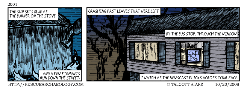
I’ve been trying to come up with a format for this poem for a while.
Tags: 2001, Bowling Green, Poetry
This entry was posted on Monday, October 20th, 2008 at 12:00 am and is filed under Comics.
You can follow any responses to this entry through the RSS 2.0 feed.
You can skip to the end and leave a response. Pinging is currently not allowed.

October 20th, 2008 at 11:26 am
I think the layout works very well. Only nitpick I have is wasn’t the tv on the opposite wall in that place. ;)
October 20th, 2008 at 7:56 pm
Thanks!
Good catch. Yeah, it was on the other side. It was also a few apartments down. But if I put it where it really was, then there would have just been more apartments, instead of the trees and the sunset ;-)